Art Deco Artists Inspire
Metallics and Bold Colors
Since the 1920s, art deco artists* have used rich colors, bold geometrics, and ornate decoration. Vivid shades reflect the art deco style. Lively colors inject life into exterior and interior spaces and create a glamorous look.
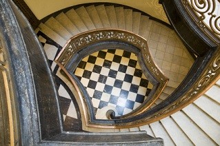
Distinct contrast is a recognizable feature of this impressive visual arts style. Checkerboard patterns in contrasting colors (like black and white) frequently show up in art deco designs. Interesting color palettes (such as chrome and cobalt blue or crystal and black) create a luxurious ambiance.
Art deco colors can range from bright and glossy hues to cool pastels to metallic shades on both interiors and exteriors. Jean Dunand is an example of a well-known artist of this era. He was the premier source of unique, lacquered furnishings of this time.
Architecture
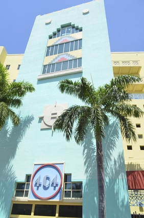
Pink pastels really delight sightseers and residents alike in South Beach, Miami. The sunny yellows, cool blues, and natural greens of tropical art and design reflect this style's palette. Buffalo City Hall, also built during this era, looks impressive with its terracotta color and Native American patterns. Often Art Deco buildings would use metals (such as aluminum, stainless steel, copper, and bronze) to highlight and add color or masonry element.
Interiors
With contemporary design, try choosing metallic shades to take your style indoors. Metallic colors work well with art deco materials such as chrome, glass, and mirrors. Which color you choose can be a reflection of your personality color - or the color that best represents your character and style.
Change living room colors by introducing Art Deco design through painting the entire space in a bright, bold shade or just add a lively touch with accents. Choose ceramics in vibrant orange, warm brown, or fiery red.
Inspired Combos
Popular combinations include mustard, navy blue, sea green, tan, and white - or - gray, coral-red, navy blue, gray-blue, and black. Choose earth tones with a hint of coolness. Try Benjamin Moore's classic and timeless Gray Pinstripe shade (1588) - a deep gray with subtle blue undertones - a throwback to Old World glamour created by the original art deco artists. Pair with dark Nightfall (1596) and Soft Chamois (969) or bold Mexicana (2172-30) and White Winter (OC-21). Emphasize the look with these colors and transform your space back to the 1920's in no time!
*Some Art Deco artists include Rene Lalique (French glassmaker), Jean Dunand (Swiss designer), Raymond Hood (American architect), Jean Dupas (French designer), William Van Alen (American architect), Paul Manship (American sculptor), Erté (Russian/French painter and designer), Jacques-Emile Ruhlmann (French furniture designer), and Louis Sullivan (American architect), as well as other talented artisans.
If you need help with this design style, Contact Me.
Return from Art Deco Artists to Room Color Schemes Home
Share This!
Contact KC

KC Cohn
Color & Design
Consultant
Room Color Schemes is the creation of KC Cohn. KC is an internationally acclaimed Color Consultant, getting her start in the Washington, DC, metropolitan area.
She has studied architecture abroad in Finland, has an Interior Architecture degree and a Master's in Construction Management.
With over 20 years experience working and training others in color and design, KC now pours all her passion and knowledge into Room Color Schemes!
If you own a business, ask about KC's Branding Color Schemes to attract more clients.
Contact KC Cohn
for more information or to schedule an appointment.
Recent Articles
-
Menu of Services Offered for a Peaceful Home & Life
The power of peace in your life is the foundation to getting what you really desire. Here is a menu of services we offer so you can attain your best life along with... -
Best Training Programs for Color Consultants
 Experience the most comprehensive Color Consultant training program you’ll find anywhere! Launch your dream career as a Color Consultant quickly… even with no prior experience.